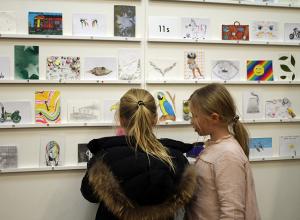


History of Art teacher Hannah Kroes took Sixth Former to the Courtauld Impressionists exhibition at the National Gallery. Here are their impressions
The National Gallery's Courtauld Impressionists exhibition combines the French Impressionist collections of the Courtauld with that of the National. Students are currently studying a module on nineteenth century French and British art, so they were able to see some of the case studies from our syllabus, including Manet's masterpiece Bar at the Folies-Bergere.

Lower Sixth student Sandy Parkinson-Smith writes: 'The layout of the exhibition was very useful because it was separated by artist, and included information on each of them, as well as captions for the paintings themselves. There were also photographs around the exhibition of locations in which the paintings originally hung in Samuel Courtauld's home.
'My favourite artwork in the show was van Gogh's 'Wheatfield with Cypresses' (1889). I could clearly see each brushstroke on this painting and felt personally engaged with the artist. The impasto technique meant that the natural light in the gallery bounced off the work, making it seem bright. The warm layered yellows, blues, and greens seemed to give the painting three-dimensionality and the swivelled brushstrokes make the wheat look as if it is blowing in the wind. The cool colours recede and the warm colours come out towards the viewers, drawing them into the picture.'
Lower Sixth student Miki Fallstrom also loved this painting. She writes: 'This painting depicts a beautiful landscape image of a wheat field on a sunny, breezy day. Van Gogh’s use of a simple and warm colour palette (white, blue, yellow and green) shows that he is trying to project positive emotions to the viewer. The image in itself seems simple as it has no main focal point or story line but Van Gogh adds texture and movement to the painting by using the impasto technique which covers areas of the canvas in thick paint layers so it quite literally stands out. He also brings movement to the painting by creating the impression that a breeze is blowing using lots of curved, wavy lines rather than harsh straight ones in the clouds and trees. I love this painting because of the bright colours and the style of depicting the landscape.'

Another favourite painting was Monet's Autumn at Argenteuil, which we were able to look closely at in order to see Monet's revolutionary technique at work. Here, he has blurred his loose brushstrokes even more in the water, creating the effect of a reflection. We could also see in person where he had scratched into the paint on the right hand side, showing the canvas underneath and adding texture.
Gracie Green, Upper Sixth, writes: 'I particularly liked the selection of Monet works including ‘Autumn Effect at Argenteuil’ (1873) which was my favourite in the collection. I liked this painting because I thought that the way Monet created the reflection in the water through the use of his pointillist style was very impressive and just as effective as some of the more conventional ways of painting. Furthermore, the subtle pastel colours used in this painting created the effect of a calm and tranquil scene.Overall I thought that the whole exhibition was very successful and the effect of having so many different styles of Impressionism in one room was very visually exciting, as I could see the differences between the major artists of the Avant-Garde period and how each one saw and chose to portray society at the time.'